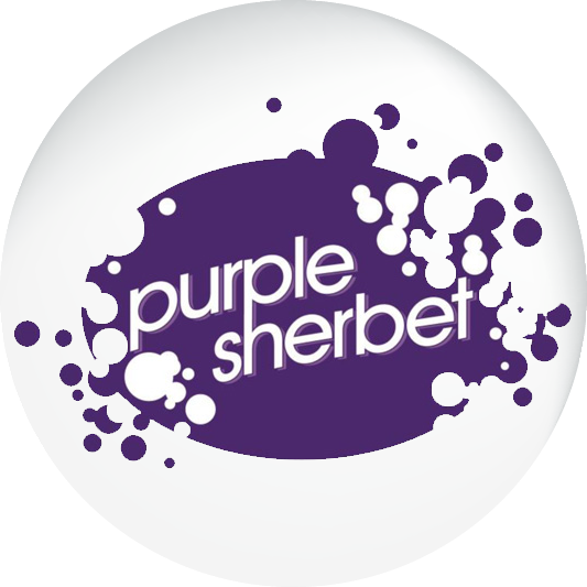


Purple Sherbet
Purple Sherbet contacted Graphic Edge to help them with new branding. They felt their logo looked too corporate and wasn't reflecting the right culture of the public relations company. They wanted a logo which would show the "fizzy" aspect of sherbet. The new tagline "The Brand Building Consultancy" was chosen to work with the new branding.

Beyond Beauty
Graphic Edge provided new branding for Beyond Beauty, a new beauty spa in China. Beyond Beauty wanted to show a clean, green New Zealand approach to business and differentiate the business from the competition targeting an upper income Chinese and Western market. At the same time they wanted to emphasise the high-tech equipment used in the business. Branding ties in with decor to show a professional and consistent image.


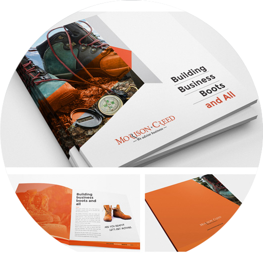
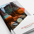
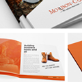
Morrison Creed
Palmerston North accountants, Morrison Creed, contacted Graphic Edge to help them differentiate themselves from other accountants and financial advisers with a unique brochure design. A storybook approach was taken and assistance with copywriting provided.
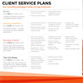
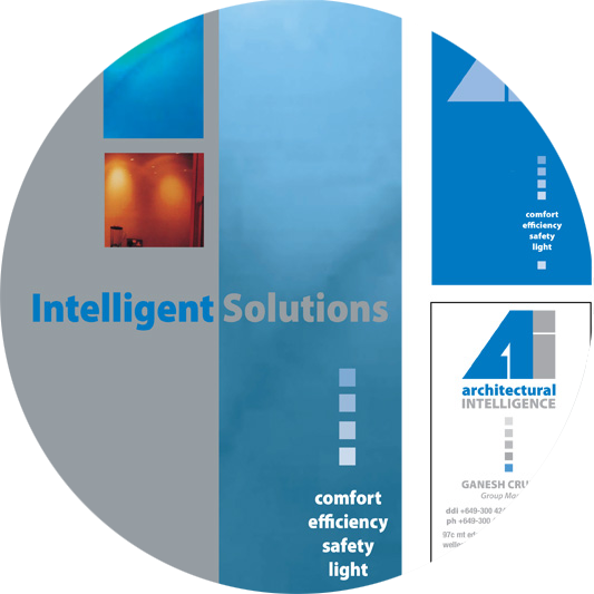
Architectural Intelligence
Direct Control needed a new brand to reflect the upmarket nature of their new product range. Graphic Edge provided several branding options which emphasised the lighting and intelligence aspects of the products and reflected the architectural element. Concepts were carried through to business stationery, point of sale, website, and large format promotional material.


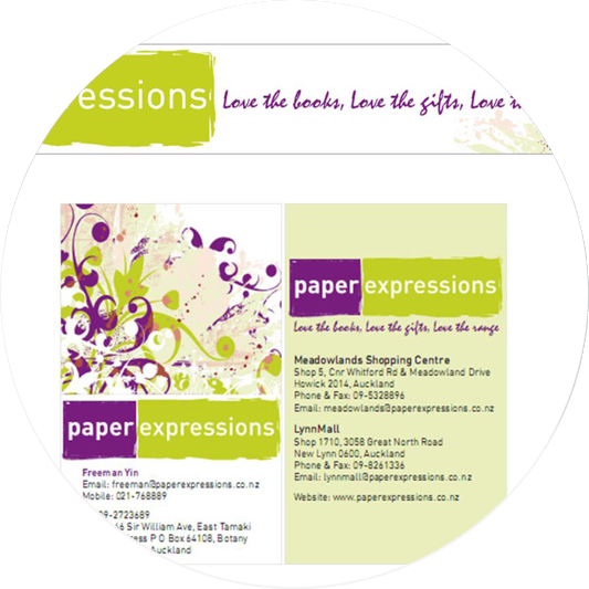
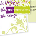
Paper Expressions
Graphic Edge designed a logo, tagline, stationery, and signage for the new Paper Expressions chain of stores. Graphic Edge helped Paper Expressions to successfully launch the brand with the opening of three stores.


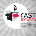
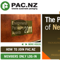
Packaging Council
Graphic Edge have provided the concepts, logo, and other marketing collateral for the Environmental Packaging Council over several years. Logo concepts have emphasised ideas of reducing the carbon footprint. Launch of the Awards has been at the Foodtech Packtech Expo.


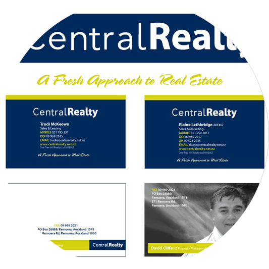
Central Reality
Central Realty was re-branded from Remax Newmarket. As a new franchise it is important that they have strict brand guidelines to ensure consistency across offices. Previously with the Remax brand there had been some inconsistency in their image across media. Graphic Edge provided a modern look which has been applied across stationery and signage.


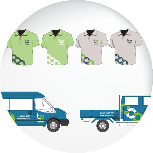
TP Engineering
Over time and with growth of the company, TP Engineering's image had become dated. Graphic Edge provided designs for new logo, stationery, branded clothing, website, and vehicle signage.


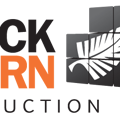
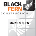
Black Fern Construction
Graphic Edge designed Kiwi-inspired branding for the Vancouver company, owned by a New Zealander. A bright colour was chosen to stand out on site signage.

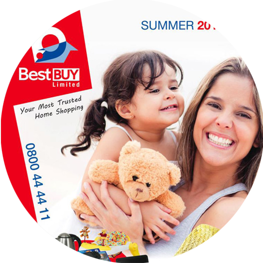
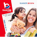
Best Buy
With the launch of the company, Graphic Edge designed logo, stationery, catalogues and flyers and e-commerce website to professionally position the business appropriately in the New Zealand market.


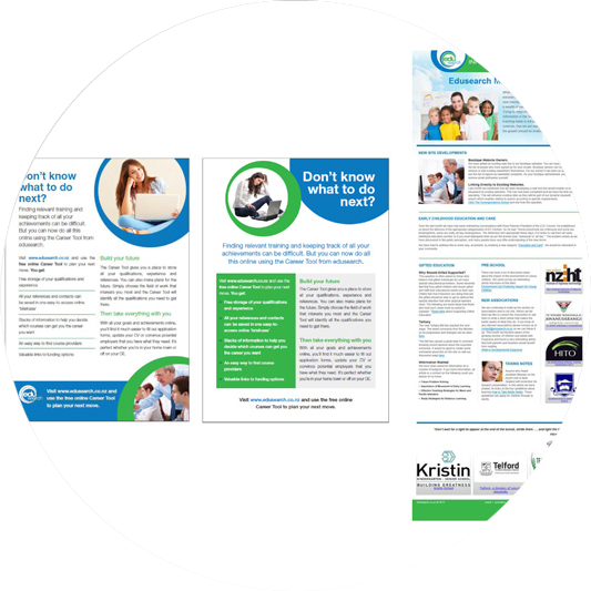
EduSearch
After 10 years, EduSearch’s branding was looking dated and inconsistent. Graphic Edge designed new branding, stationery, brochures, and website to re-position the business in the market correctly and promote future growth.


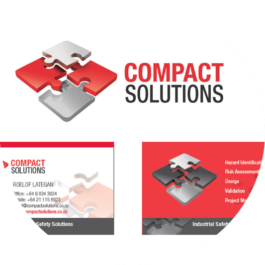
Compact Solutions
Graphic Edge designed branding, stationery and brochure for Compact Solutions and have provided copywriting assistance where required.